

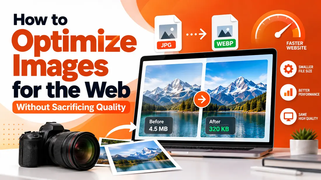
Images can make a website feel more engaging, professional, and trustworthy. A well-chosen product photo, a clear infographic, or a compelling hero image can help visitors understand a message faster than text alone. But there is a catch: images that look great can also slow down a website if they are not optimized properly.
For business owners, bloggers, marketers, and web designers, image optimization is an important part of creating a better online experience. Large image files can increase loading times, frustrate mobile visitors, and affect how easily people navigate a website. The good news is that improving image performance does not require advanced technical skills or expensive software. With the right approach, you can keep your visuals sharp while making your pages faster and more efficient.
Why Image Optimization Matters for Website Performance
Website speed influences how people interact with a page. Imagine opening an online store to compare two products. One page loads almost instantly, while the other takes several seconds to display its product images. Most visitors will naturally prefer the faster experience.
Images are often among the largest files a browser needs to download. When a website contains multiple high-resolution photos, large banners, or decorative graphics, these files can add considerable weight to each page.
Optimizing images helps address several common problems:
- Faster loading times: Smaller files generally require less time to download, especially on slower mobile connections.
- Improved user experience: Visitors can browse products, read articles, and interact with page elements without unnecessary delays.
- Better mobile performance: Optimized visuals make websites more accessible to people using limited data plans or older devices.
- More efficient storage and bandwidth: Smaller files can reduce hosting and data-transfer demands.
- Stronger SEO foundations: Page speed and user experience contribute to website performance, although image compression alone does not guarantee higher search rankings.
Image optimization is not simply about making every file as small as possible. The real objective is finding a practical balance between visual quality and file size.
Choose the Right Image Format Before Compressing
One of the easiest ways to improve image performance is to select a suitable file format. Different formats serve different purposes, and choosing the wrong one can result in unnecessarily large files or poor visual quality.
JPEG for photographs
JPEG is widely used for photographs, blog images, travel pictures, and product photography. It uses lossy compression, which removes some image information to reduce file size. When the compression level is chosen carefully, the difference in visual quality can be difficult to notice.
However, repeated editing and saving can gradually reduce quality. For this reason, keep an original copy of important photographs.
PNG for graphics and transparency
PNG is useful for logos, interface elements, screenshots, and graphics that need transparent backgrounds. It generally preserves image information better than JPEG, but the resulting files can be larger, particularly for detailed photographs.
If a PNG photograph is taking up too much space, consider whether another format would be more appropriate.
WebP and AVIF for modern websites
WebP and AVIF are modern image formats that can deliver smaller files at comparable visual quality in many situations. They are worth considering when building or updating a website, provided your publishing platform and workflow support them.
The best choice depends on the image itself, browser requirements, transparency needs, and how the website delivers its content.
How to Reduce Image File Sizes Without Losing Visible Quality
Compression is one of the most practical ways to improve website performance. Instead of uploading a photograph directly from a camera or design application, take a moment to prepare it for its intended use.
For a straightforward workflow, an online JPG compressor can help reduce the size of a JPEG image without requiring specialized editing software. This is especially useful when preparing blog illustrations, product photographs, portfolio images, or promotional graphics for publication.
The key is to check the result rather than assuming that the smallest file is automatically the best one.
Start with the image dimensions
Before adjusting compression, consider whether the image is larger than necessary.
For example, suppose your website displays a blog thumbnail at approximately 600 pixels wide, but the uploaded image measures 4,000 pixels across. If the page never displays the original at full size, those extra pixels may offer little practical value.
Resize the image to suit its intended display dimensions while accounting for high-density screens where necessary. This reduces the amount of information the browser needs to download.
Adjust compression gradually
When using lossy compression, aggressive settings can introduce visible artifacts, blurry edges, and unnatural textures. These problems are particularly noticeable in faces, fine text, product details, and images containing sharp lines.
A reliable method is to create a few versions with different compression levels and compare them side by side.
Pay attention to:
- Fine details around edges and textures.
- Color transitions, especially in skies and gradients.
- Small text embedded in graphics.
- Skin tones and other areas where subtle visual differences matter.
Choose the smallest version that still looks good at its actual display size. There is rarely a reason to preserve every original pixel if visitors cannot see a meaningful difference.
Optimize Images for Mobile Users
Mobile visitors deserve special attention because they may be browsing on slower networks or devices with limited resources. A large desktop banner, for instance, might look impressive on a wide monitor but become unnecessarily heavy when delivered to a phone.
Responsive images help solve this problem by allowing a website to provide different image sizes for different screen conditions. Modern HTML features such as srcset and sizes can help browsers select an appropriate version.
There are also several practical steps you can take without changing your website’s code:
- Resize large images before uploading them.
- Avoid using full-resolution photographs when a smaller version is sufficient.
- Test important pages on a mobile device, not just a desktop computer.
- Check whether your website platform automatically creates smaller image variants.
- Use lazy loading for appropriate images that appear farther down the page.
Lazy loading allows certain images to load when visitors approach them rather than downloading everything immediately. However, avoid delaying the main image that appears at the top of the page if it is important for the initial loading experience.
Write Descriptive File Names and Alt Text
Technical performance is only one part of image optimization. Search engines also need context to understand what an image represents, while visitors using assistive technologies benefit from meaningful alternative text.
Start by giving files descriptive names. Instead of uploading a photograph called IMG_8392.jpg, use a clear name such as minimalist-wooden-desk.jpg when it accurately describes the image.
Next, add useful alt text. For a photograph of a wooden desk in a home office, an appropriate description might be: “Minimalist wooden desk with a laptop and desk lamp beside a window.”
Keep descriptions accurate and concise. Avoid stuffing alt text with unrelated search terms or repeating the same keywords across every image. Decorative images that add no meaningful information can often use empty alt attributes, allowing screen readers to skip them.
Descriptive file names and relevant alt text provide context, improve accessibility, and help search engines interpret visual content.
Use Image Dimensions That Match Your Layout
Uploading optimized files is not enough if the website displays them inefficiently. Image dimensions should make sense for the layout in which they appear.
A full-width homepage banner has different requirements from a small profile picture or a thumbnail in a related-articles section. Preparing a separate version for each use can prevent unnecessary downloads.
For example, an online store might use:
- A medium-sized image in category listings.
- A larger image on the product details page.
- A high-quality source image for a zoom feature, when necessary.
This approach gives visitors the detail they need without forcing every page to load the largest available file.
It is also helpful to specify image width and height in the page markup. Doing so allows the browser to reserve the appropriate space before the image finishes loading, reducing unexpected layout shifts.
Measure Results Instead of Guessing
Image optimization should be part of an ongoing website maintenance routine. After making changes, check whether they actually improve the experience.
Tools such as Google PageSpeed Insights and Chrome DevTools can help identify large images, inefficient formats, and other performance issues. These tools may also reveal problems unrelated to images, such as slow server responses, excessive JavaScript, or render-blocking resources.
Compare results before and after optimization, and focus on the pages that matter most to your visitors.
For an online store, that might mean starting with product pages that receive the most traffic. For a blog, it could mean optimizing popular articles that contain numerous photographs. For a portfolio, the priority may be image-heavy project pages.
A simple audit can reveal opportunities you might otherwise overlook:
- Identify pages with unusually large image files.
- Check whether images are appropriately sized.
- Review image formats and compression levels.
- Test loading performance on mobile devices.
- Revisit important pages after publishing new visual content.
Remember that performance measurements can vary with network conditions, device capabilities, and caching. Look for consistent improvements rather than expecting every test to produce identical results.
Conclusion
Optimizing website images is a practical way to improve loading speed, accessibility, and the overall browsing experience. By choosing suitable formats, resizing files, applying sensible compression, and adding descriptive metadata, you can maintain attractive visuals without making your pages unnecessarily heavy. Start with your most important pages, measure the results, and build image optimization into your regular publishing workflow. Small improvements across many images can make a meaningful difference to how people experience your website.